· v0.6.0
Sharper at small sizes
Every icon is now snapped to the pixel grid at 16, 20 and 24px, solid icons have true curves, 13 icons are redrawn, and there is a new site design and one new icon.
This release is about how the icons look on screen, most of all at 16px.
Sharper at 16, 20 and 24px
One drawing can't sit on the pixel grid at every size, so thin lines used to blur. The build now makes a copy of each icon for 16px and 20px, moved onto that size's pixel grid, and the 24px drawing is snapped too. You get the right one automatically from the size you set.
Across the whole set, the share of blurred pixels drops from about 79% to 70% on standard screens and from 48% to 34% on high-density screens.
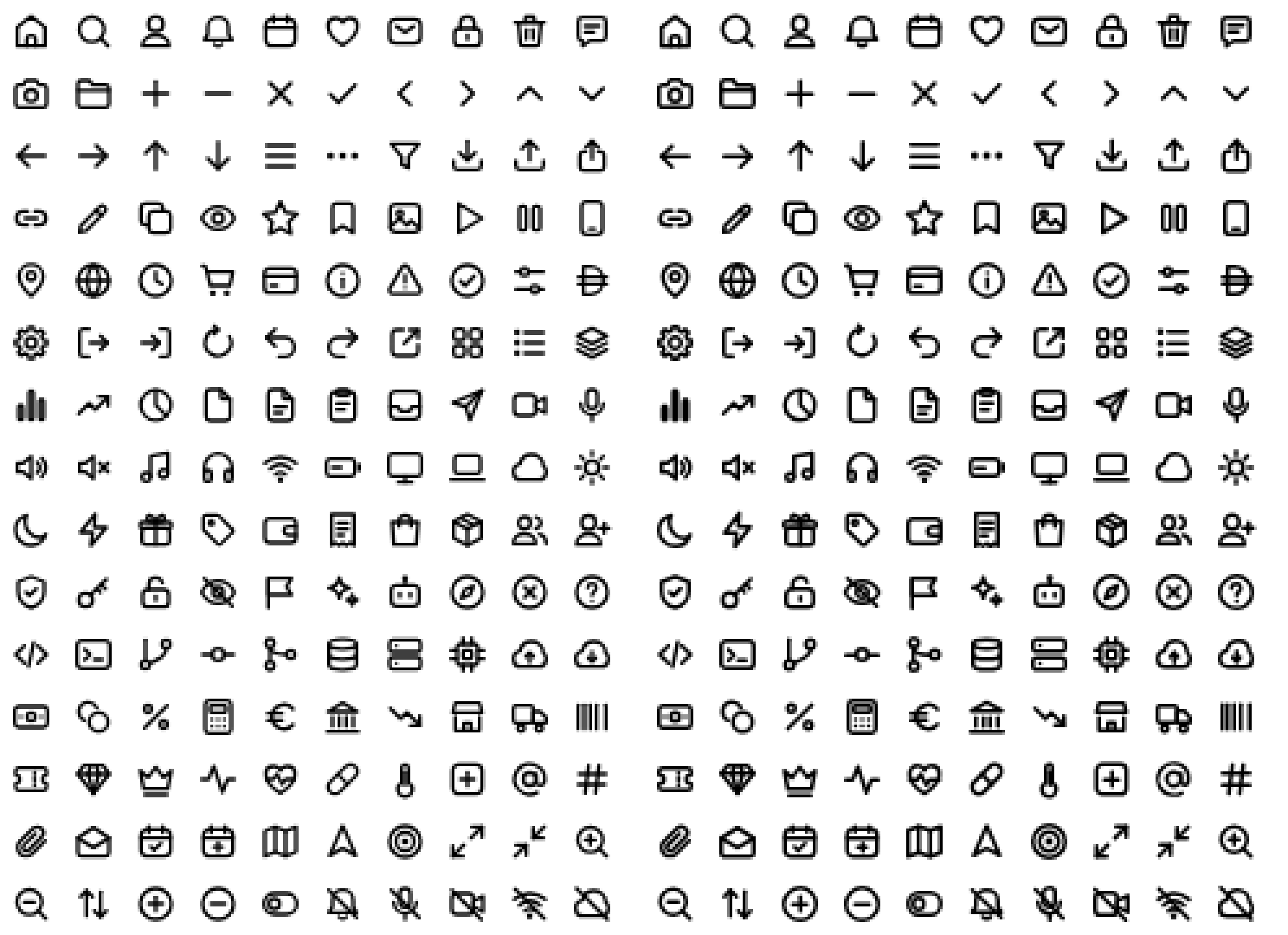
To make this work, the default stroke at small sizes is slightly heavier: 16px and 20px now draw a 1.5px line, the same as 24px. The default strokeWidth is 2.25 at 16px (was 2) and 1.8 at 20px (was 1.75). If you set strokeWidth yourself, nothing changes for you, and you get the 24px drawing at the weight you asked for.
Solid icons keep their curves
Circles cut out of solid icons, like the lens of the camera or the centre of the gear, came out as rounded squares. They are now round.
13 icons redrawn
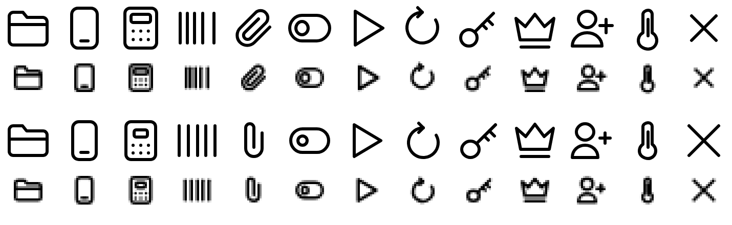
We now measure every icon against a written set of drawing rules: size, centring, and whether gaps stay open at 16px. Thirteen icons failed and were redrawn:
- Gaps that closed at 16px: folder, smartphone, calculator, barcode, paperclip and toggle-left.
- Off centre: play, key and crown.
- Outside the canvas at small sizes: user-plus and thermometer.
- Too small: close.
- Refresh has a new arrowhead that joins the arc cleanly.
Paperclip changed most: it is now upright.
One new icon
Umbrella joins the set, bringing it to 151.
A new site
icons.oma-kase.com has a new design: a hero that shows one drawing turning into every style, an icon browser with a detail panel and size guides, and a darker dark mode.
Upgrading
Install the new version as usual. Three things to know:
- Icons at 16px and 20px look slightly bolder unless you set
strokeWidth. - The 13 redrawn icons look different, paperclip and refresh most of all.
- Each icon carries a little more data, about 640 bytes, for the 16px and 20px drawings.